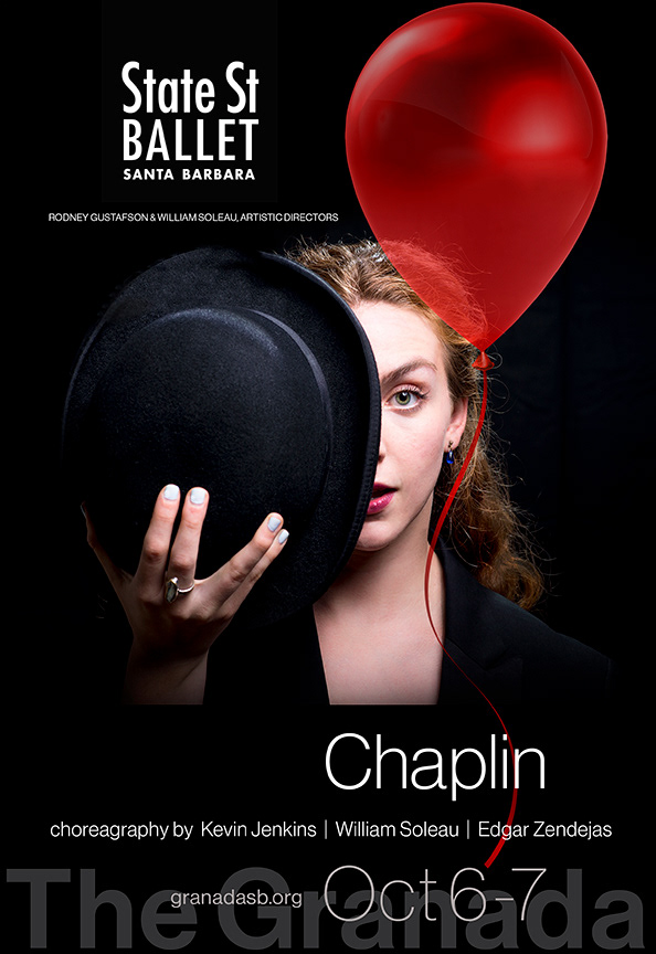
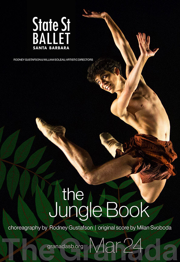
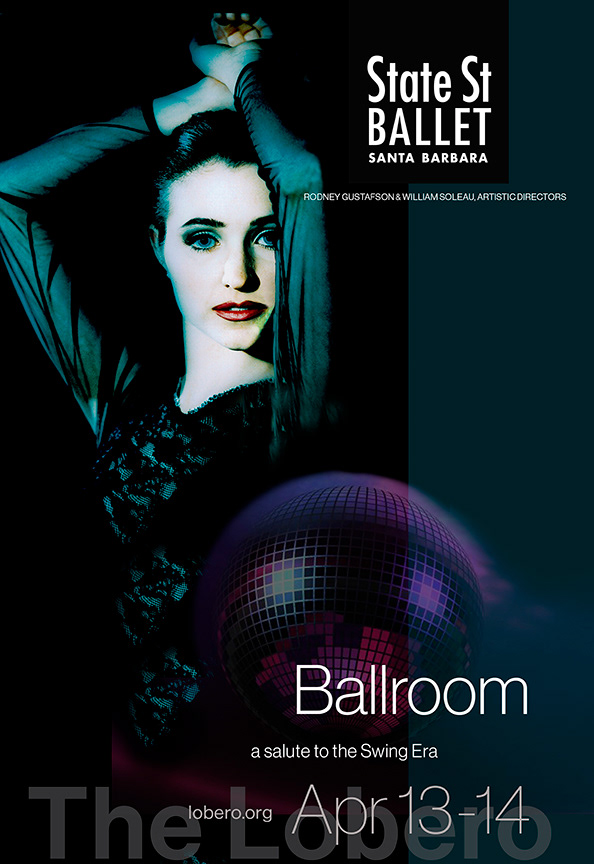
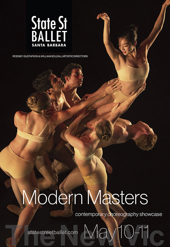
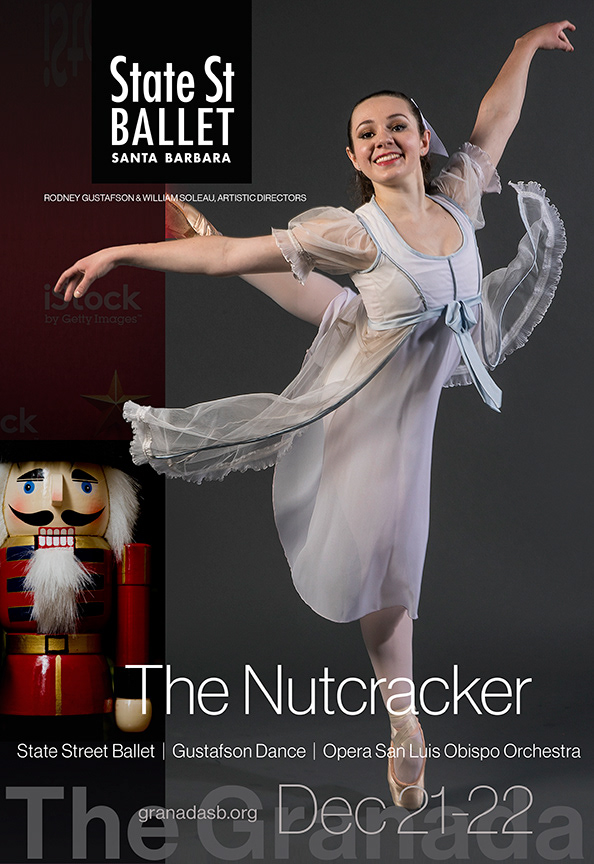
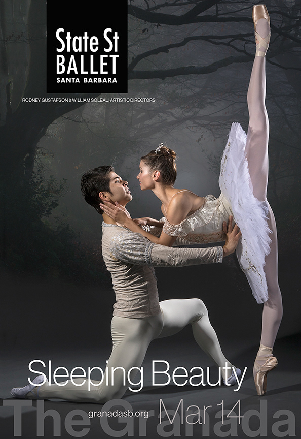
The visual language created for State Street Ballet is easy to recognize, easy to use, and has come to symbolize the company it represents. These examples of campaign collateral for a performance season illustrate the application of that language, and how it defines the brand. The logo and typographic details form a definitive framework for the distinctive photo illustrations. The familiarity of this framework and the photographic style make the brand instantly recognizable to its audience.
These examples define the art direction for the season series, and show it with maximum content. When customized across various media channels, portions of that content were subtracted. For example, digital ads contained only the image, logo, and title; social media posts featured the image by itself, with text captions.